

Early Matters
Logo Redesign & Brand Identity
A fresh identity for a new chapter in learning.
Early Matters began as a redesign of Riverside Learning, an opportunity to create a refreshed visual identity that reflected the organization’s evolving direction while maintaining a connection to its educational roots.
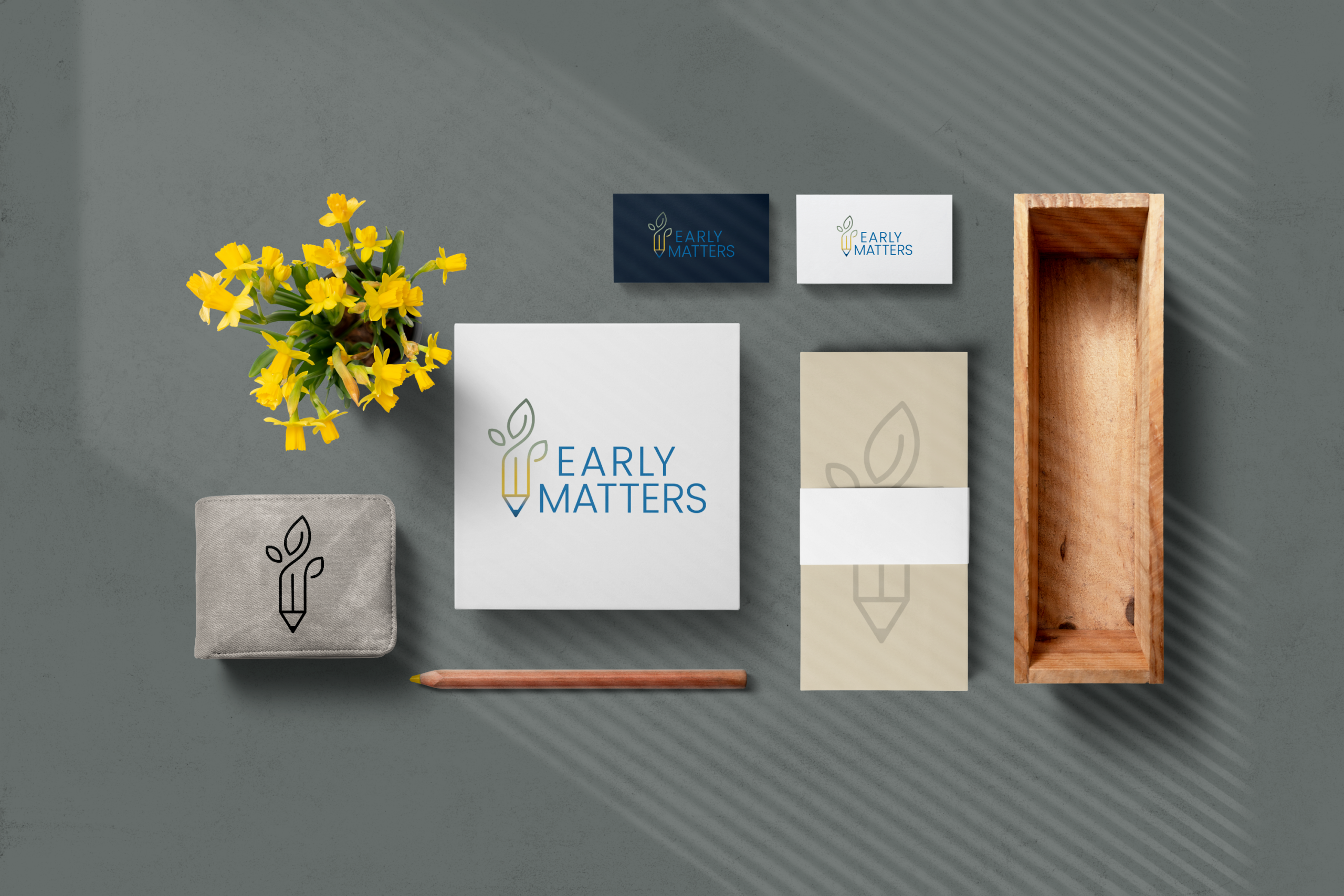
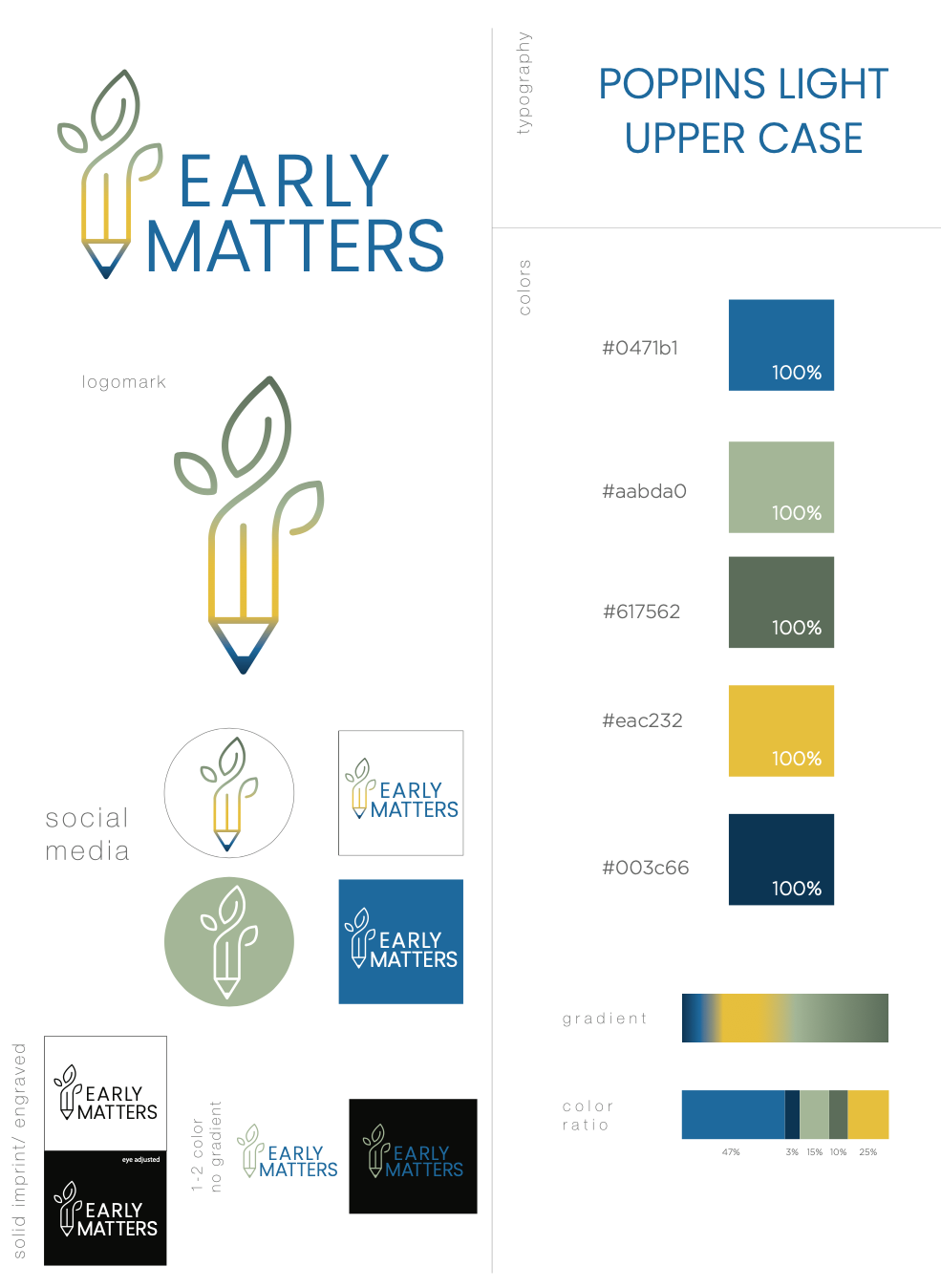
The new logo combines two familiar symbols, a pencil and a growing plant, into a single, purposeful mark. The pencil represents learning, creativity, and discovery, while the emerging leaves suggest growth, development, and the potential nurtured through education.
A thoughtful color transition from green to yellow to blue brings warmth and optimism to the identity, balancing a welcoming personality with a clean, contemporary typographic treatment.
The result is a versatile, recognizable brand identity built around a simple idea: early learning creates the foundation for lifelong growth.
Creative Scope: Logo Redesign, Brand Identity, Visual Identity Development.
Client: Early Matters, formerly Riverside Learning